Philadelphia Eleven
In 1977, eleven women made history. They were the first to be ordained as priests in the Episcopal Church, a major milestone in the struggle for women‘s ordination. Despite facing fierce opposition and backlash, they courageously stood up for their beliefs and shattered the glass ceiling. This documentary chronicles their journey and celebrates the triumph of their courage and conviction. It is a testament to the power of faith and determination to overcome prejudice and injustice.
Our task was to craft an introduction that accurately sets the tone for the documentary and captures the magnitude of these women within the first few minutes of the film.
Final Style Frames

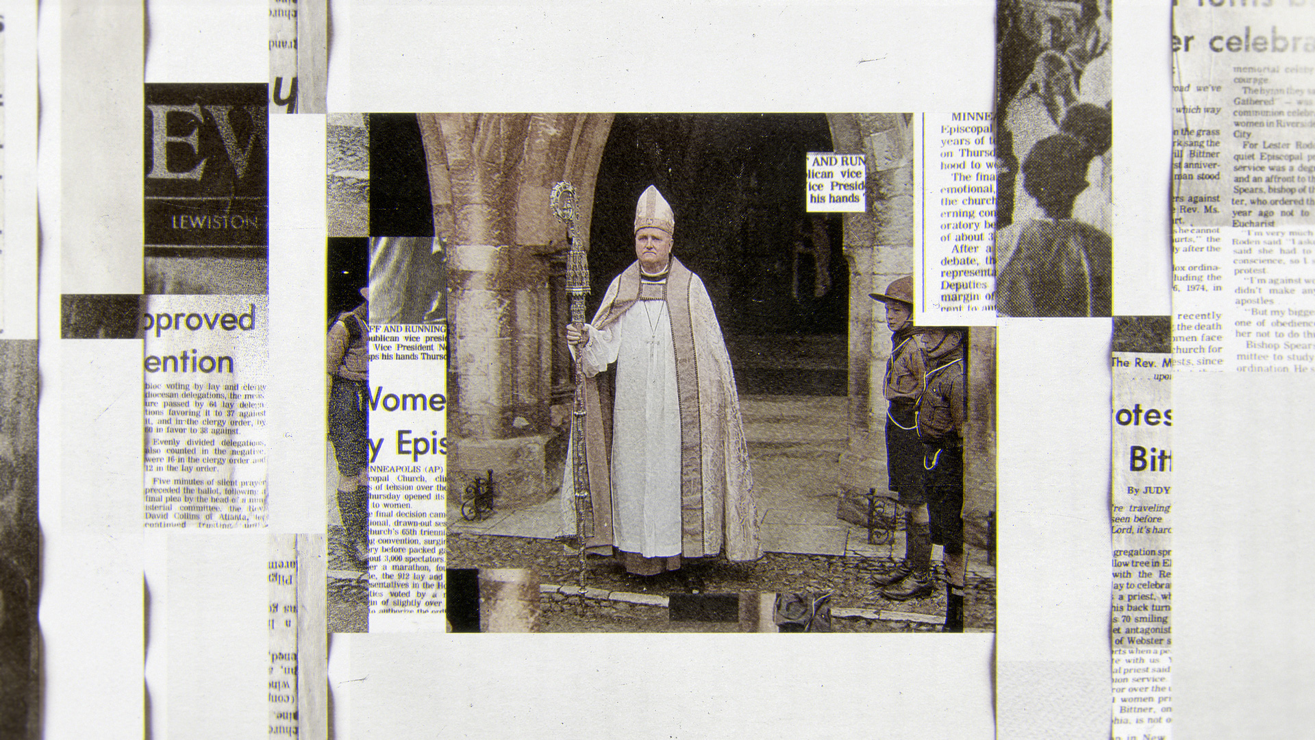
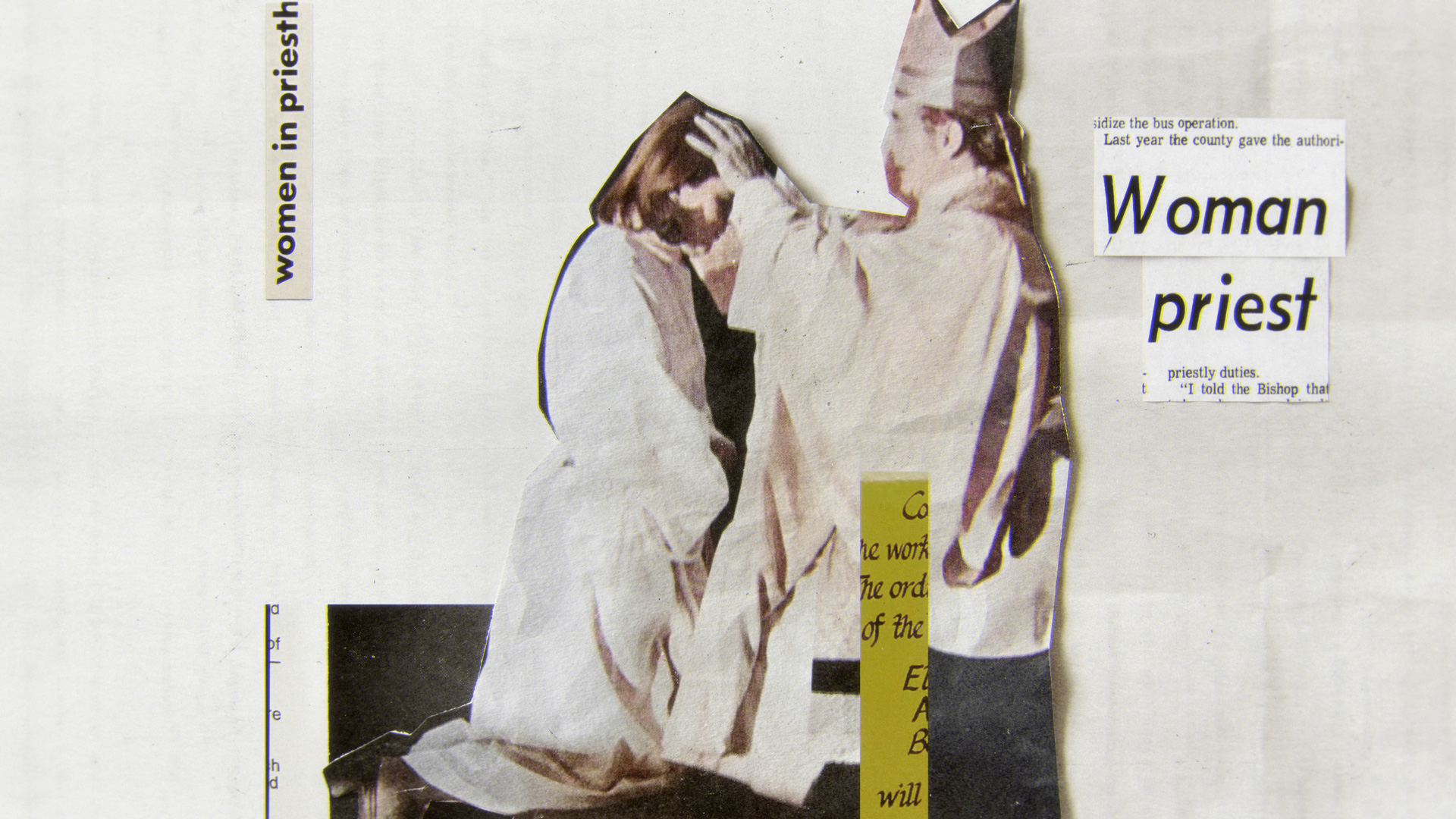
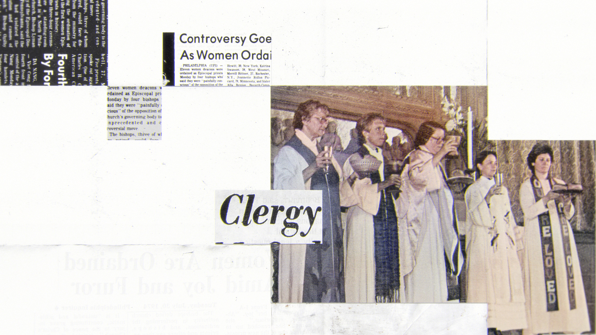
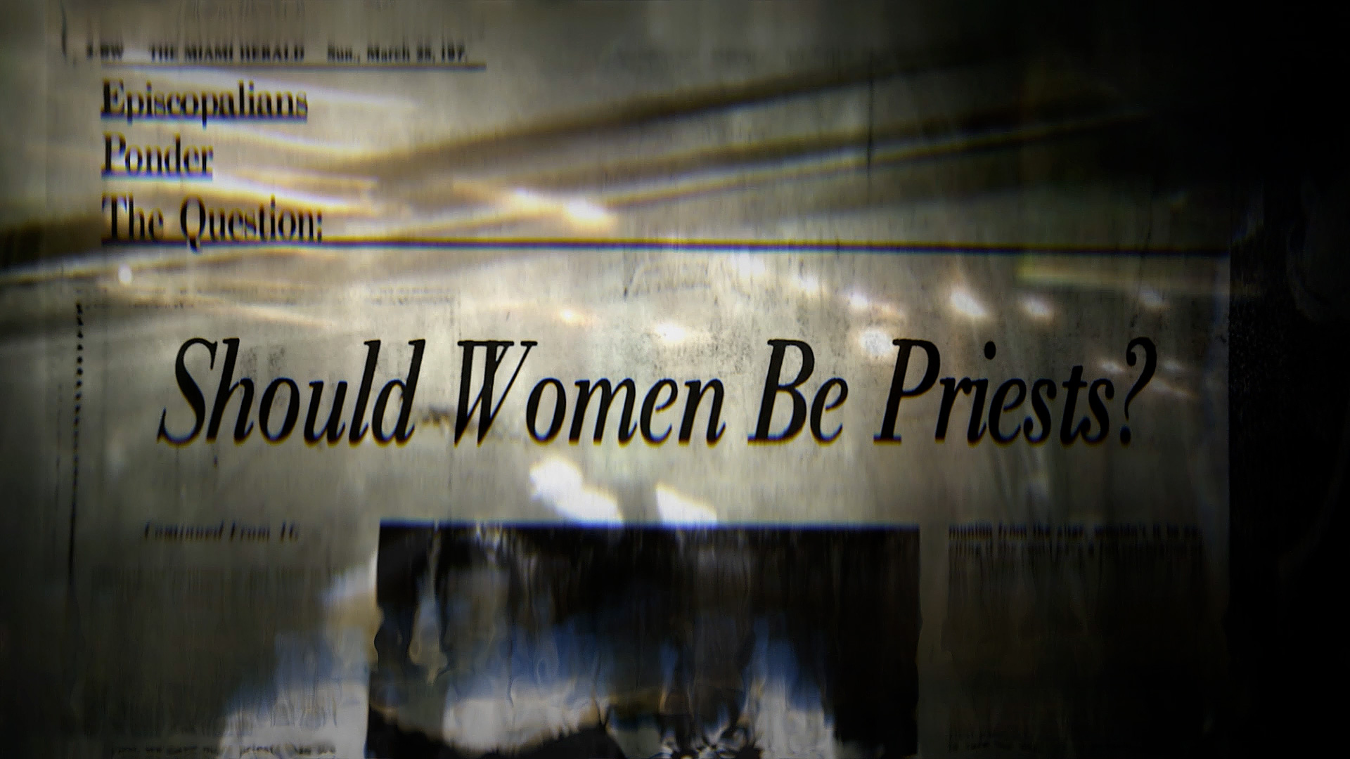
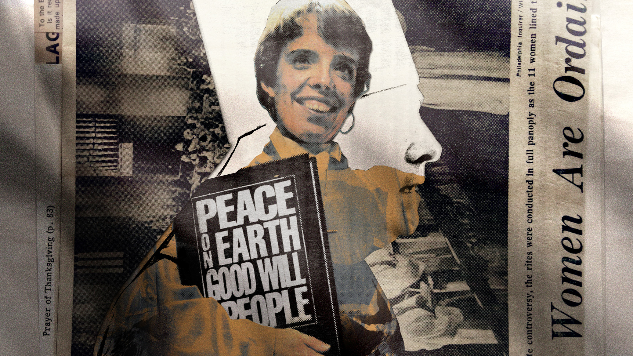
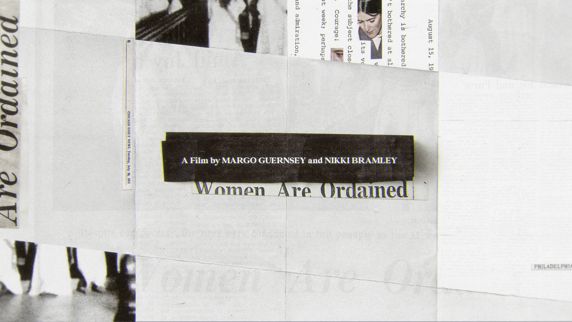
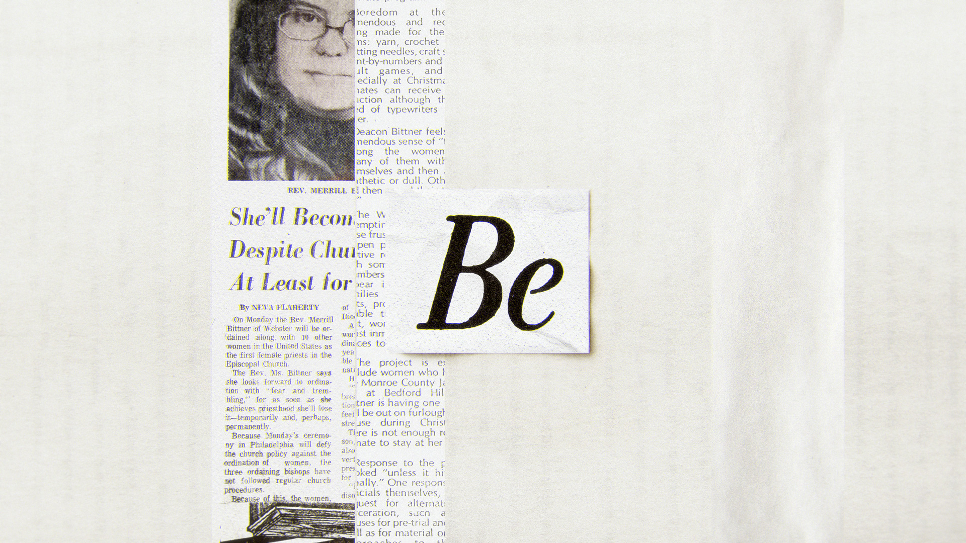
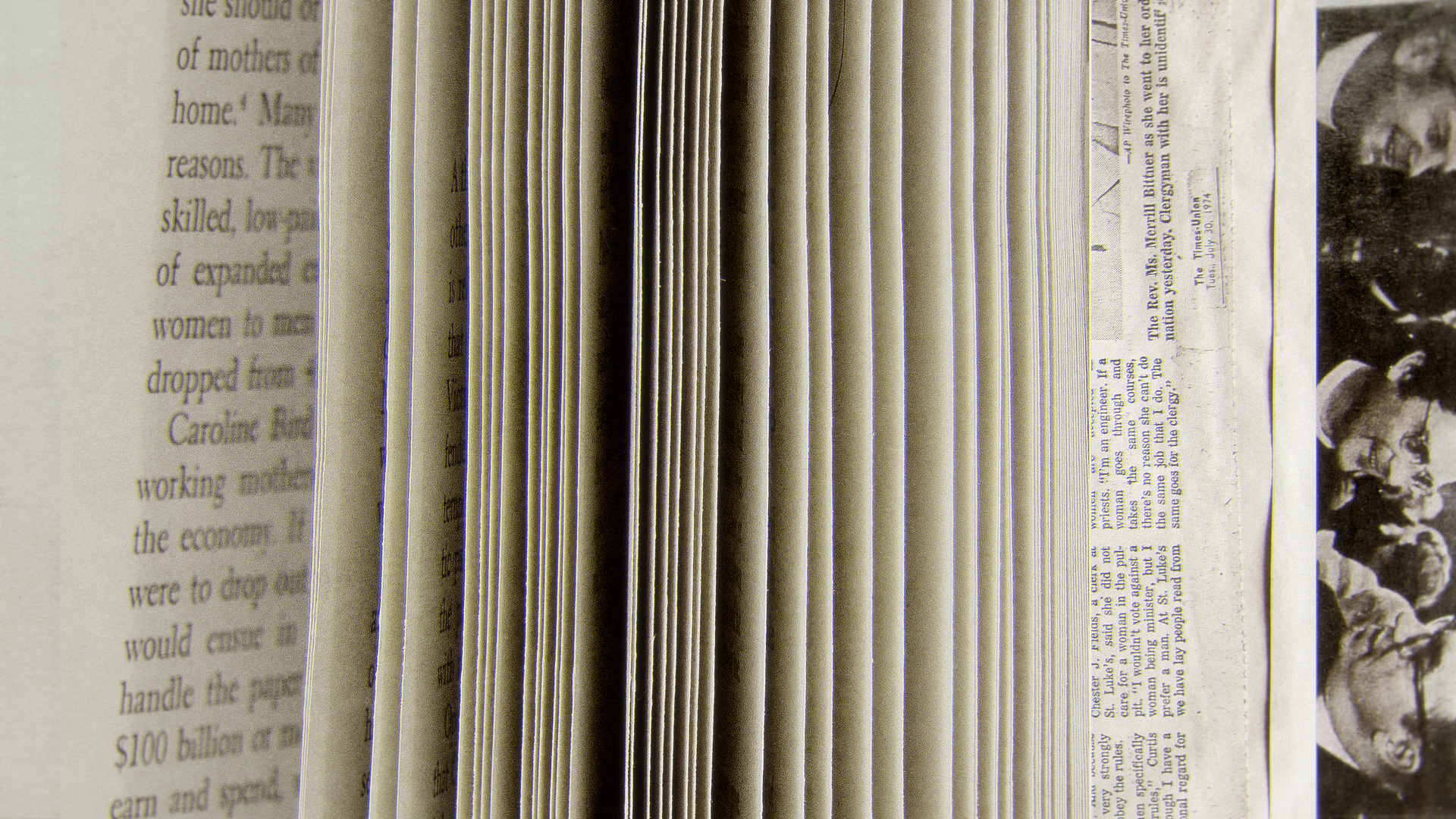
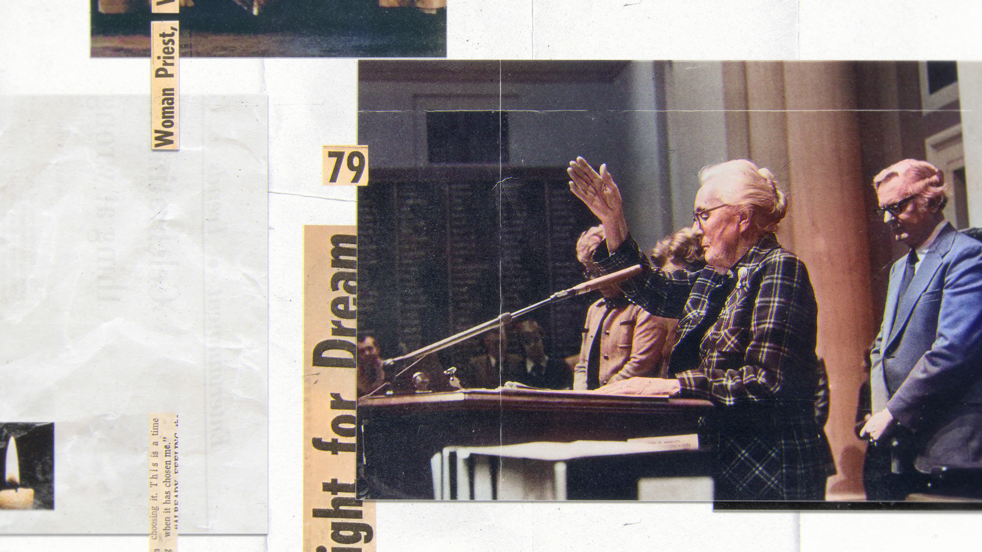
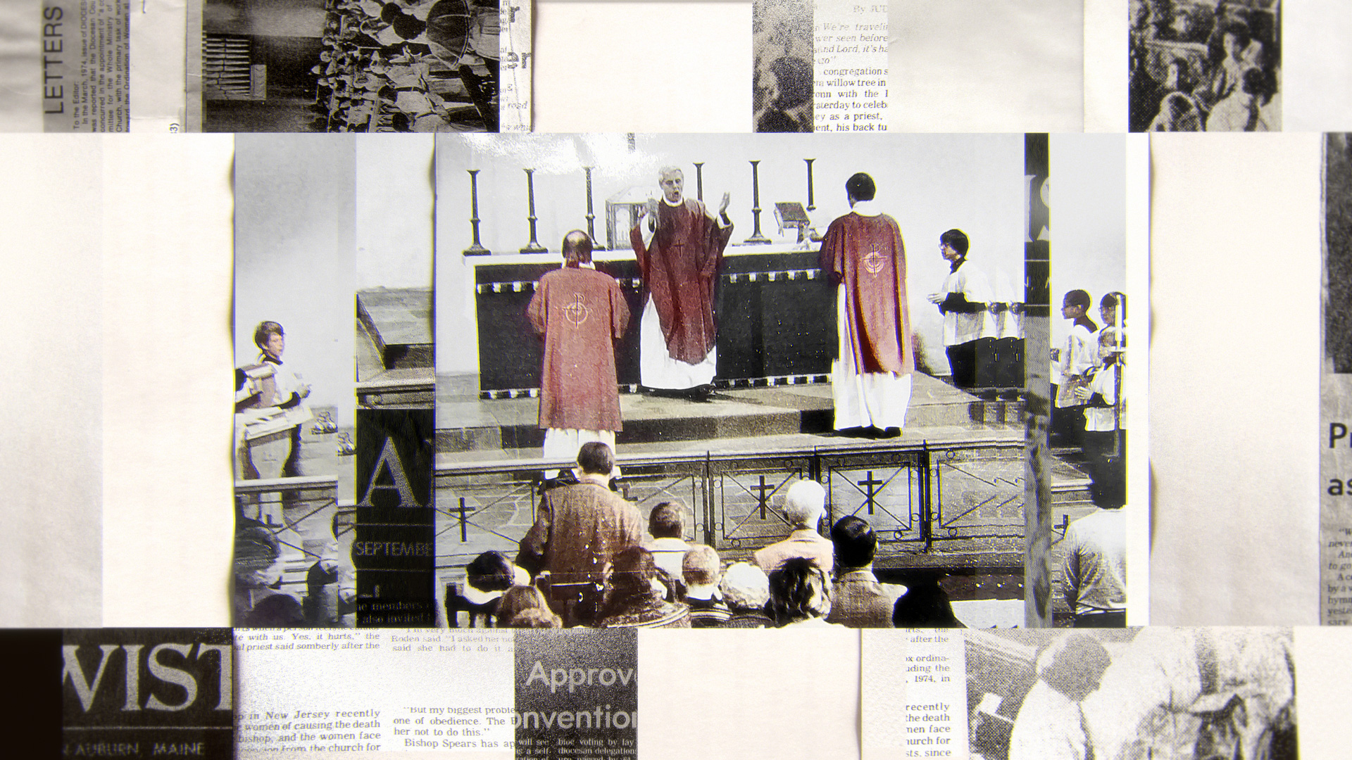
After conducting a design experimentation (outlined in the later section), we devised an art direction approach that emphasizes the project’s archival material. We employed a visual approach that lies between a collage and a collection of documents in order to combine the various sources of material. This strategy enabled us to craft a distinctive and effective visual identity for the project.
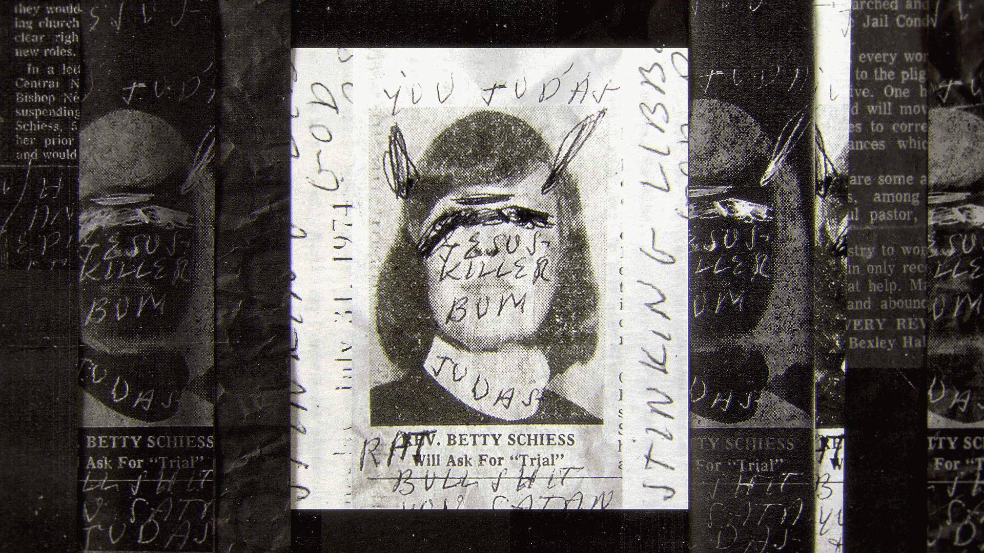
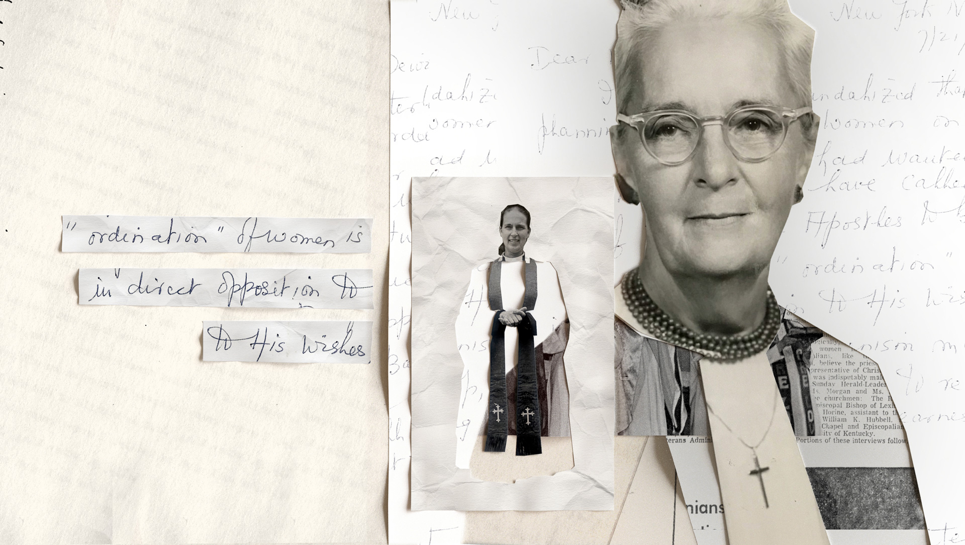
Many of the original documents demonstrate a strong resistance to the ordination of women among some Episcopal priests. This resistance was based on their interpretation of scripture and the conviction that the role of priest should be held by men.
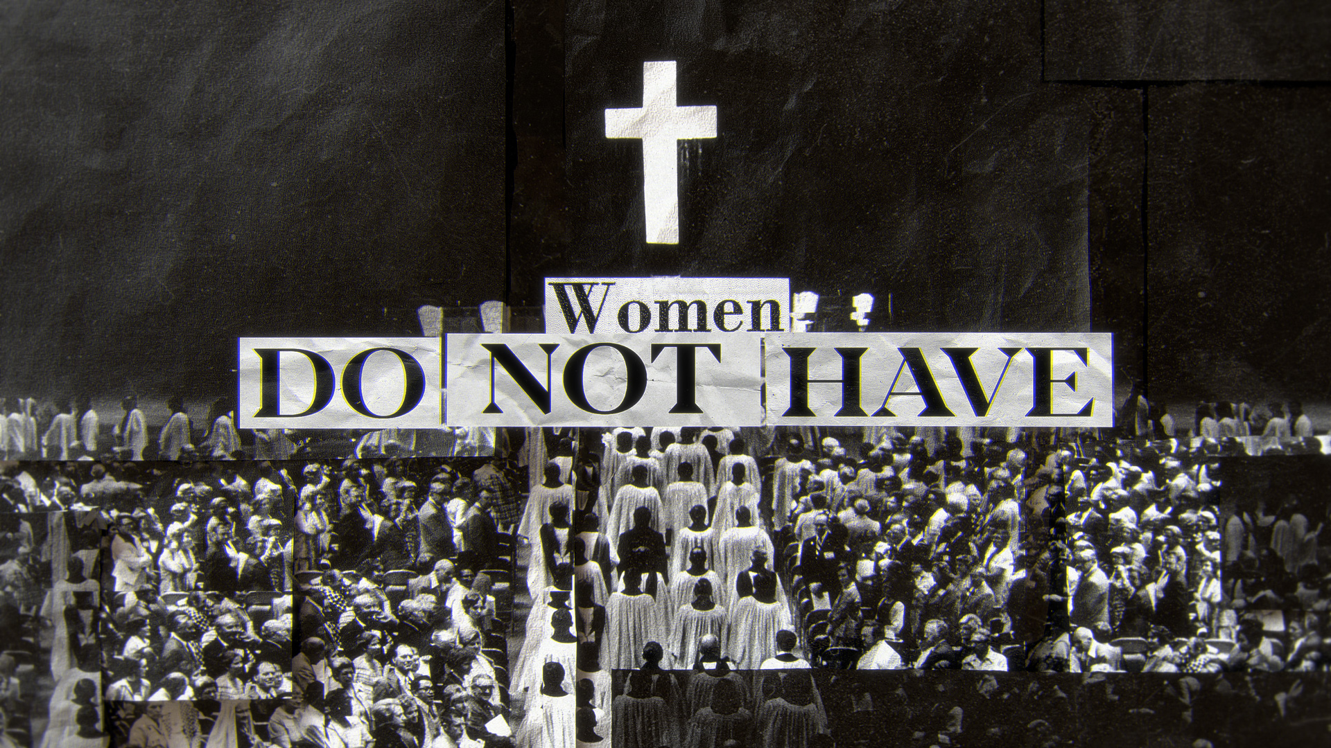

Others believed that women were not suited for the role or did not have the necessary qualifications. Some opposed the ordination of women for personal or cultural reasons.
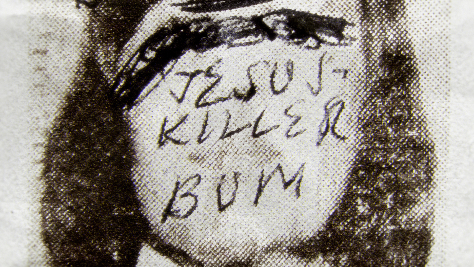
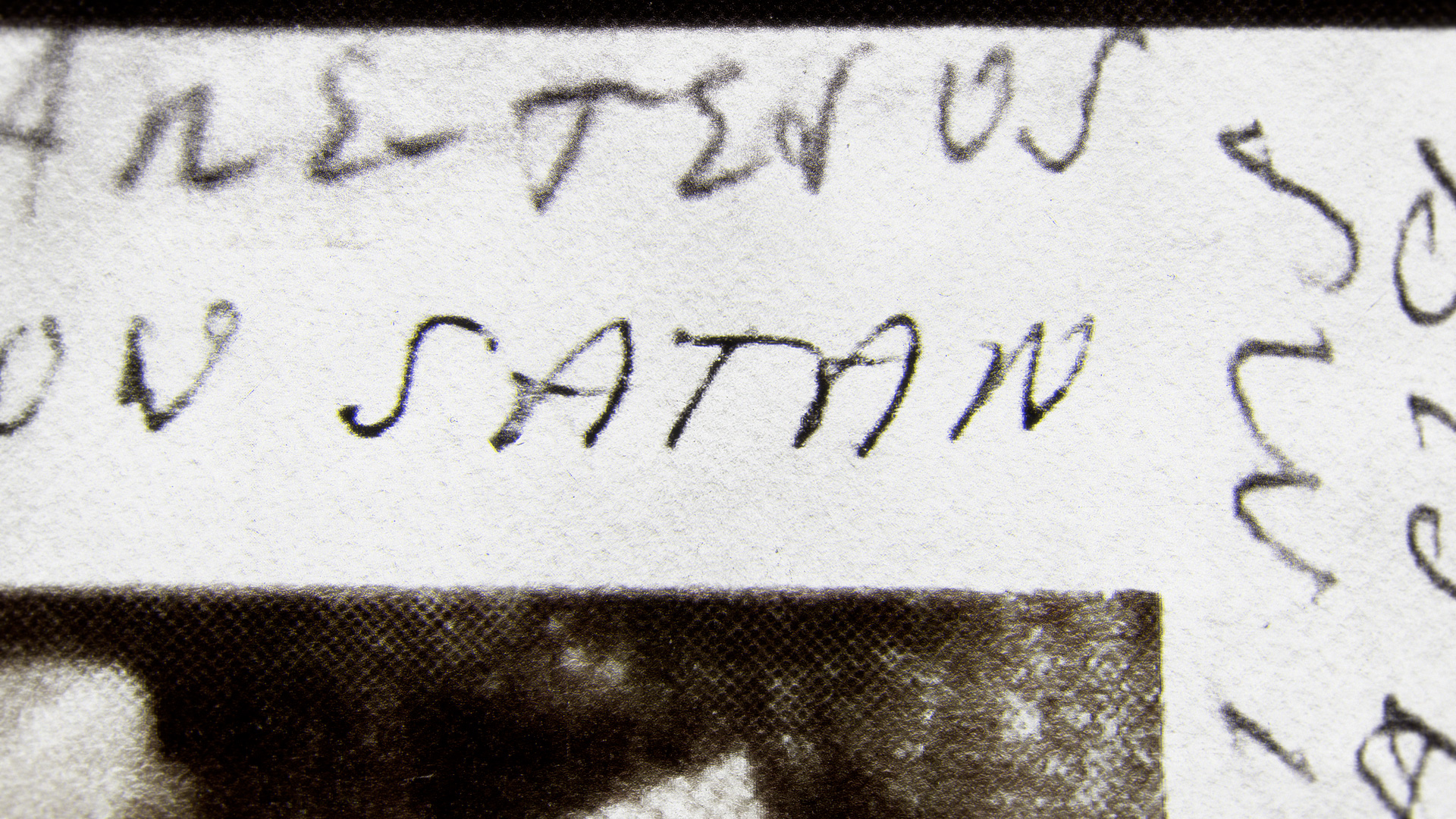
The use of original documents originated from the desire to not only share what happened, but also to emphasize the cruelty of some of these events. For instance, the derogatory words scrawled on the newspaper above were aimed at Rev. Merril and the Eleven.


Development Frames
Direction 01:
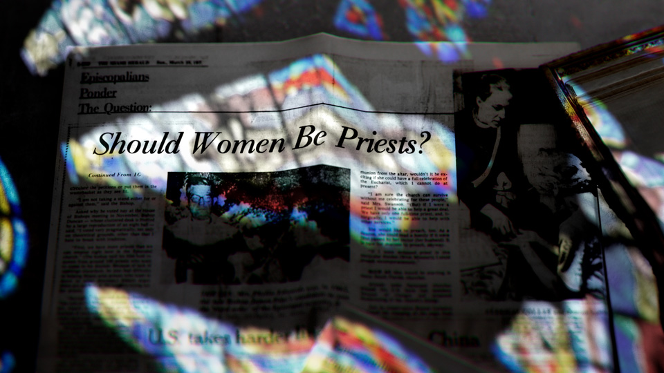
Stained glasses & optical distortions
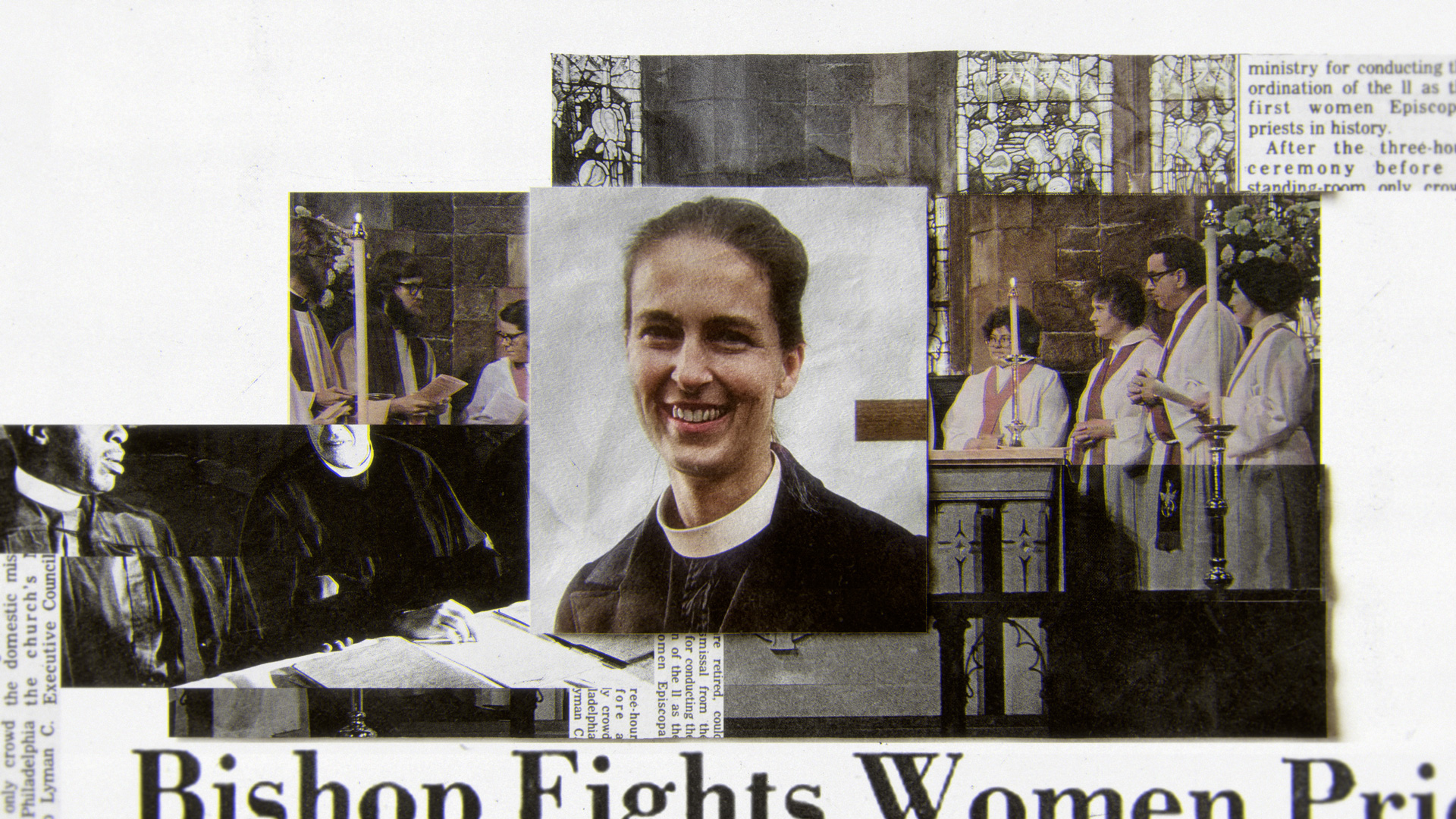
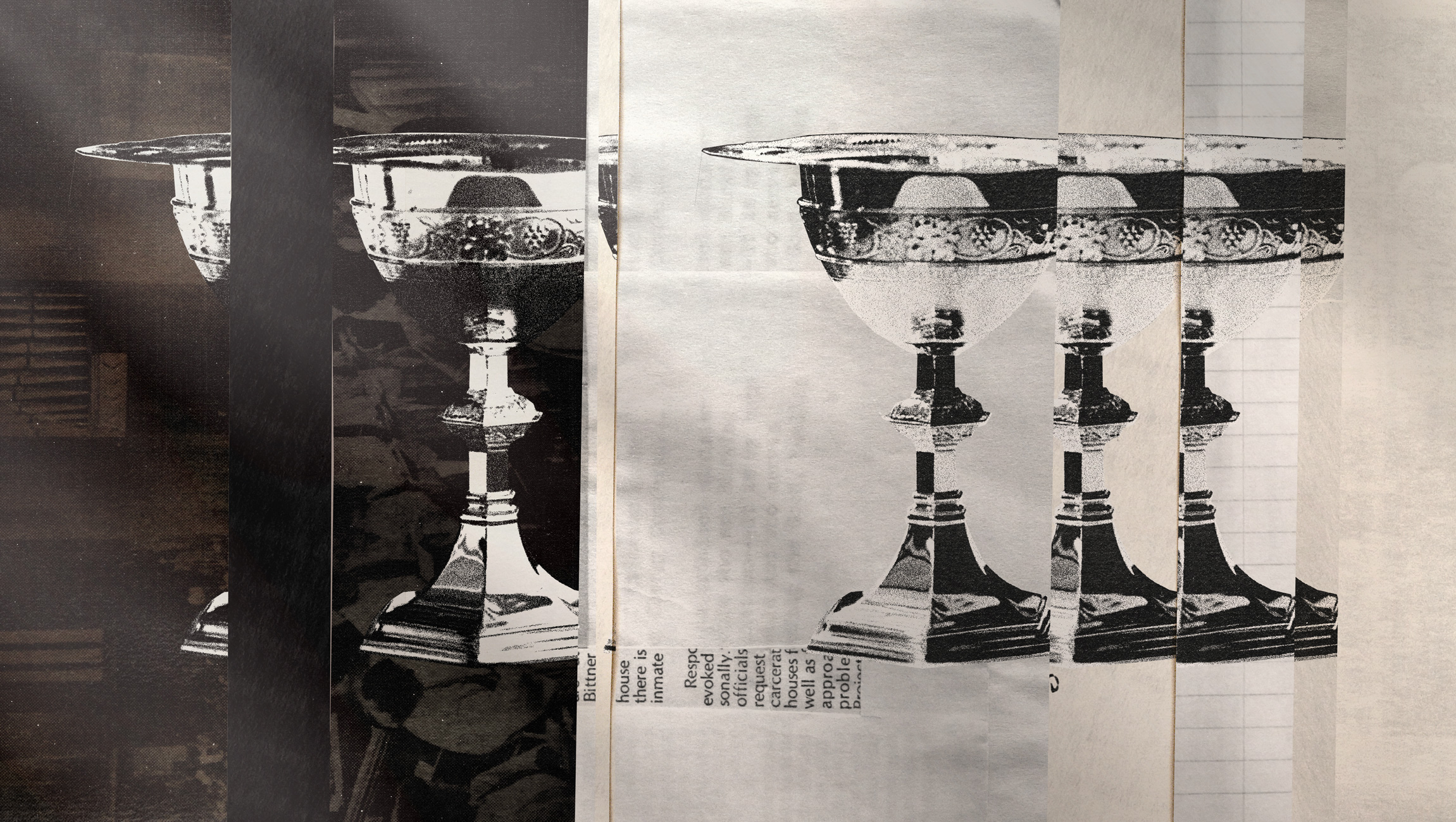
The interior of a church should be otherworldly and spiritual, so that it is immersed in light that transcends the physical world. This light would elevate one to higher truths. To bring the church environment for the opening we incorporated this concept and devised a design solution that uses light from stained glass windows. Additionally, we used optical distortions from the documentary visual library as a transition element.
Direction 02: Silhouettes
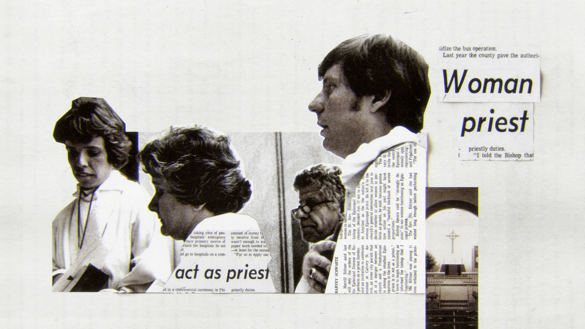
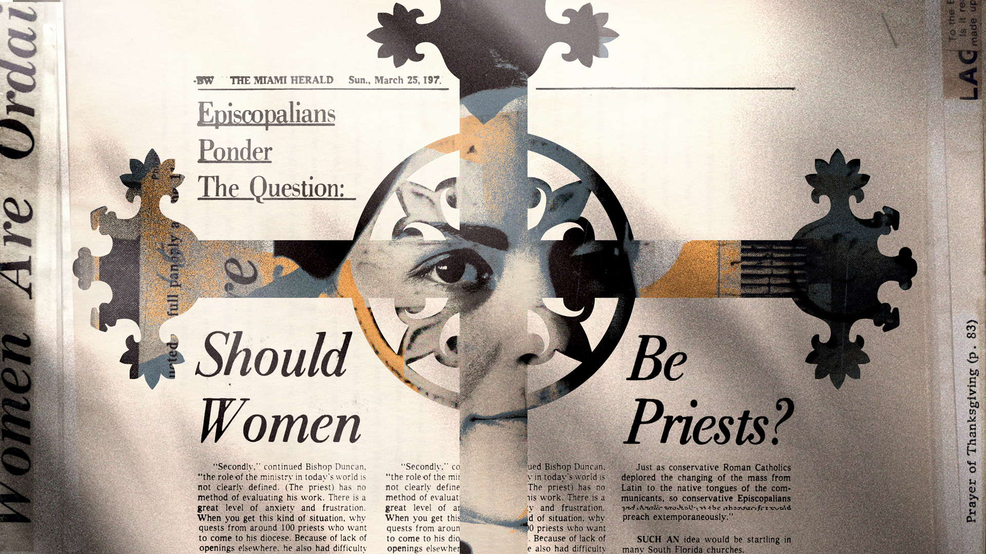
We utilized archival from what happened to create collages which provide a deeper level of interpretation. For instance, the image with the cross. In the Episcopal Church, priests are seen as a representation of Christ, thus the combination of the cross, a symbol of Christ, and the face of one of the Elevens.
Direction 03: Loud white
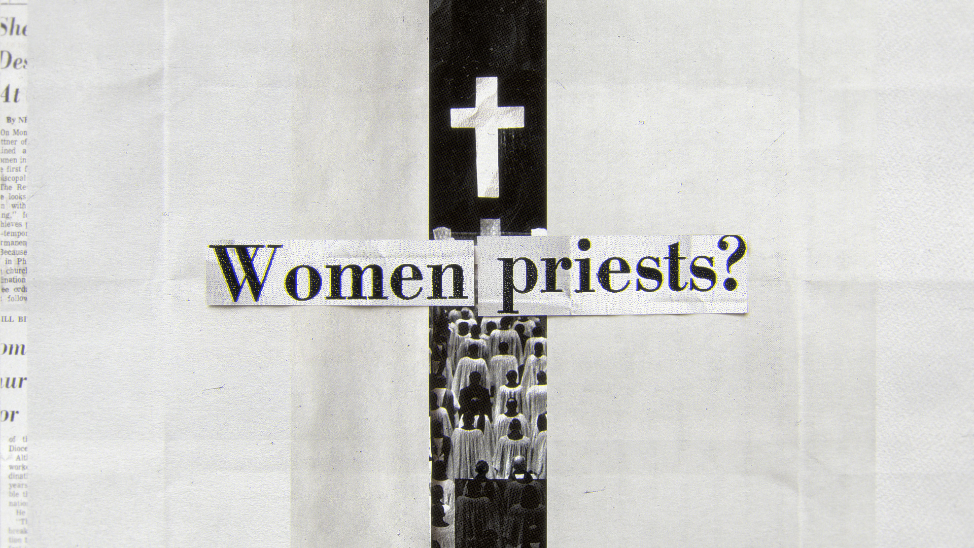
Women have been historically disadvantaged and often have to fight for recognition of their rights in different ways than men. Therefore, we tried to create an impactful art direction that was loud in a unique way, different from the normal aesthetic of power commonly found in day–to–day posters and propaganda.
Final Style Frames

After conducting a design experimentation (outlined in the later section), we devised an art direction approach that emphasizes the project’s archival material. We employed a visual approach that lies between a collage and a collection of documents in order to combine the various sources of material. This strategy enabled us to craft a distinctive and effective visual identity for the project.

Many of the original documents demonstrate a strong resistance to the ordination of women among some Episcopal priests. This resistance was based on their interpretation of scripture and the conviction that the role of priest should be held by men.


Others believed that women were not suited for the role or did not have the necessary qualifications. Some opposed the ordination of women for personal or cultural reasons.

The use of original documents originated from the desire to not only share what happened, but also to emphasize the cruelty of some of these events. For instance, the derogatory words scrawled on the newspaper above were aimed at Rev. Merril and the Eleven.



Development Frames

Direction 01:
Stained glasses & optical distortions
The interior of a church should be otherworldly and spiritual, so that it is immersed in light that transcends the physical world. This light would elevate one to higher truths. To bring the church environment for the opening we incorporated this concept and devised a design solution that uses light from stained glass windows. Additionally, we used optical distortions from the documentary visual library as a transition element.
Direction 02: Silhouettes
We utilized archival from what happened to create collages which provide a deeper level of interpretation. For instance, the image with the cross. In the Episcopal Church, priests are seen as a representation of Christ, thus the combination of the cross, a symbol of Christ, and the face of one of the Elevens.
Direction 03: Loud white
Women have been historically disadvantaged and often have to fight for recognition of their rights in different ways than men. Therefore, we tried to create an impactful art direction that was loud in a unique way, different from the normal aesthetic of power commonly found in day–to–day posters and propaganda.
Credits
Production:
Studio Hi-Lo
Creative Directors:
Diego Coutinho and Bruna Imai
Art Director:
Diego Coutinho
Design:
Diego Coutinho, Bruna Imai, Mauro Borba, Francisco Beraldo
Animation:
Diego Coutinho

